
Typography

Magazine Spread
THE PROJECT:
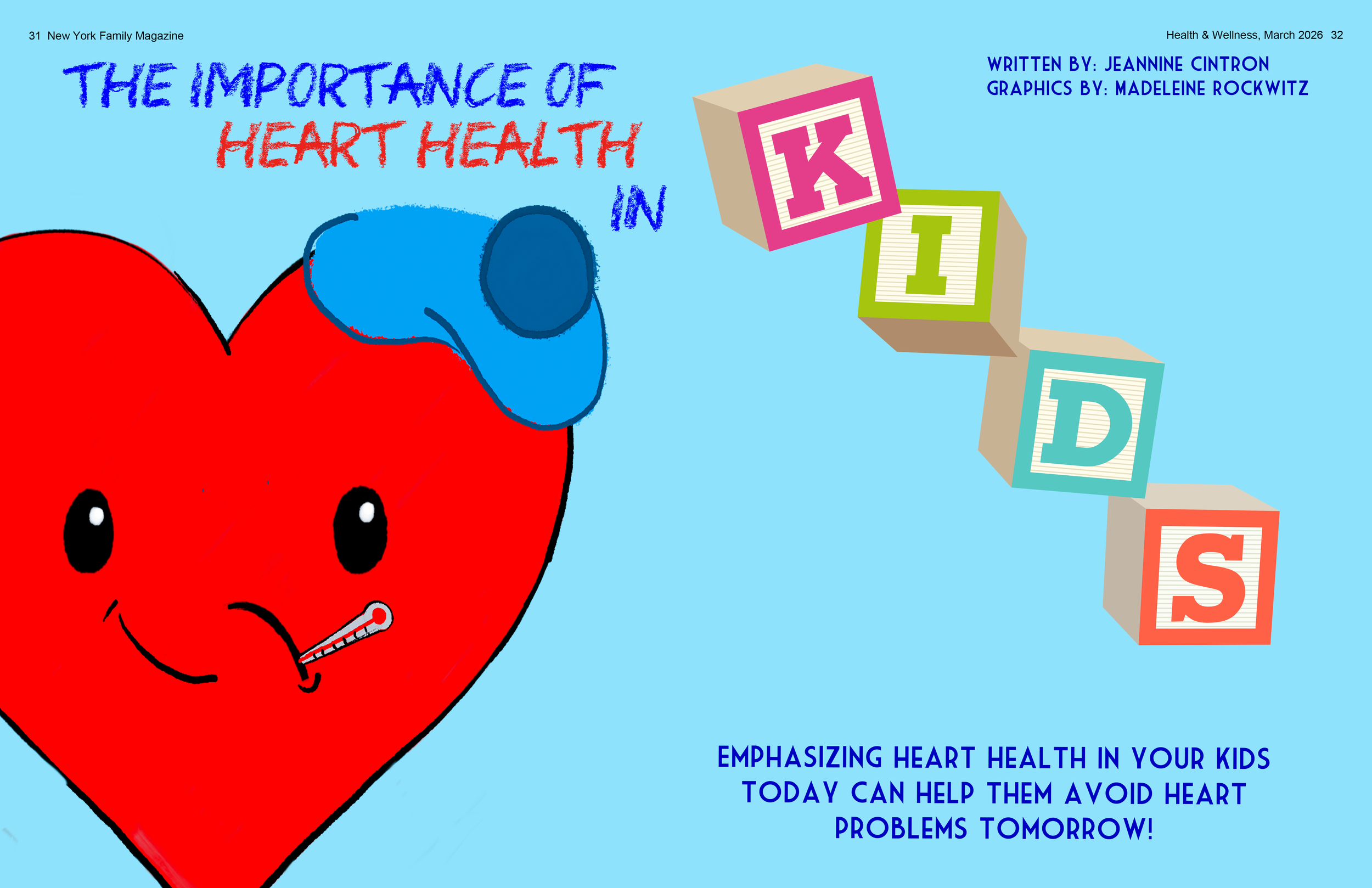
I designed a magazine spread for an article on children’s heart health. The main challenge was the many directions I could take the design in, so I needed to focus and ensure my vision remained consistent. My target audience was parents, and as a parent myself,
I aimed for it to be eye-catching and whimsical. Given the serious subject of keeping children healthy, I wanted the visuals to be engaging and complement the article. It wasn’t for a specific client but was a personal project to practice and incorporate more illustrations into my work. I see this as a great opportunity to create something imperfect yet meaningful.
THE PROCESS:
In my design process, I began with a sketch that served as the centerpiece of the spread. From there, I decided to include images of ABC blocks. I only used the images I created myself and the ABC blocks image, avoiding any external pictures. Initially, I experimented with several different images, but I found they distracted from the main focal point. Consequently, I removed those images and opted for a color-blocked background instead. After looking at my image, the heart I created didn’t seem up to par with the work I do. I scrapped the idea and focused on using images from Pexels. I love it so much more.
Based on the very helpful feedback I received, I decided to redesign the layout. I aimed to keep some elements on the left and others on the right, ensuring nothing was blocked when opened. Additionally, I wasn't happy with how my images looked in the previous layout; they looked messy, and I wanted a cleaner, more polished design.
https://www.pexels.com/photo/toy-soldiers-standoff-on-white-background-36300907/
https://www.pexels.com/photo/close-up-of-toy-blocks-4491702/

A redesigned Governors Ball Poster
Made in Indesign

A poster displaying a pet peeve
Made in Indesign

reimagined Frank Ocean album covers

Made in Photoshop

Reimagined Tour poster
Paired with the Channel Orange album cover.
Made in Photoshop